HumanKind - TEDxSydney
TEDx
TEDxSydney is the leading platform for the propagation of Australian ideas, creativity and innovation to the rest of the world.
TEDxSydney in their 9th year approached us to help with their campaign and roll out for this year’s theme of HumanKind.
Read moreHumanKind - TEDxSydney
TEDx
TEDxSydney is the leading platform for the propagation of Australian ideas, creativity and innovation to the rest of the world.
TED is a nonprofit devoted to spreading ideas, usually in the form of short, powerful talks. TED began in 1984 as a conference where Technology, Entertainment and Design converged, and today covers almost all topics — from science to business to global issues — in more than 100 languages.
TEDxSydney in their 9th year approached us to help with their campaign and roll out for this year’s theme of HumanKind.
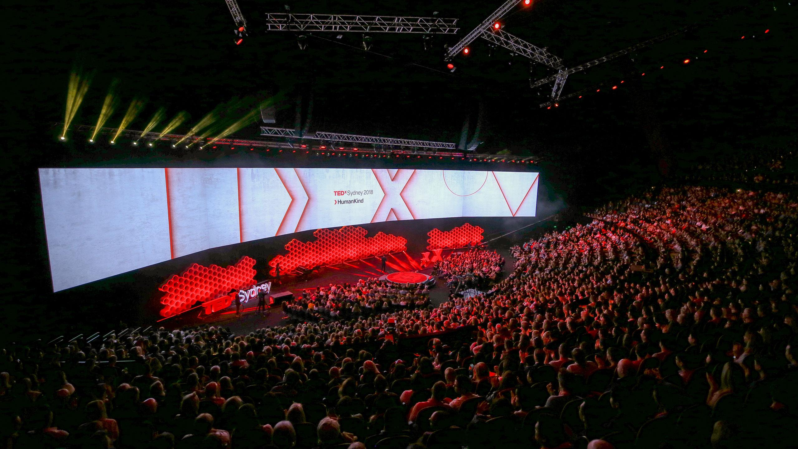
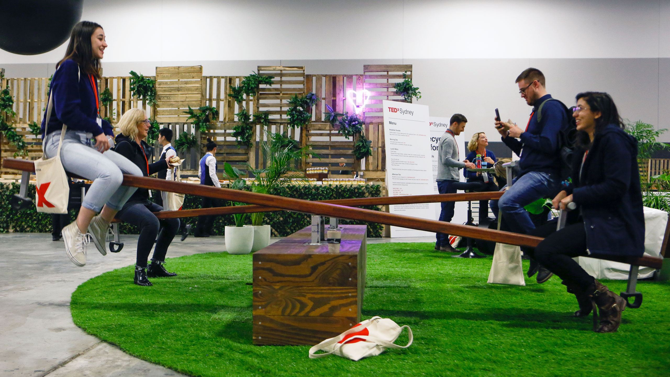
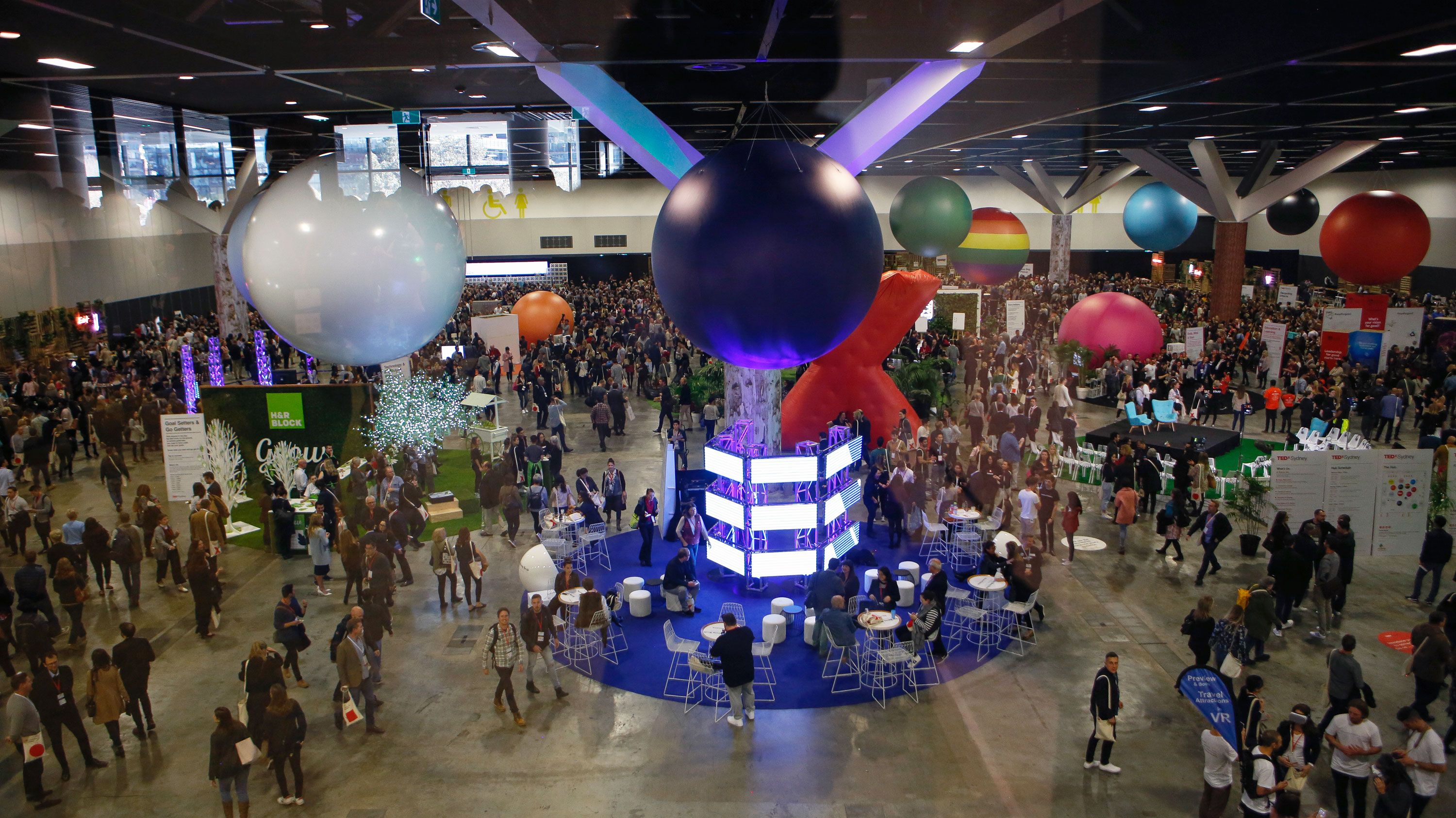
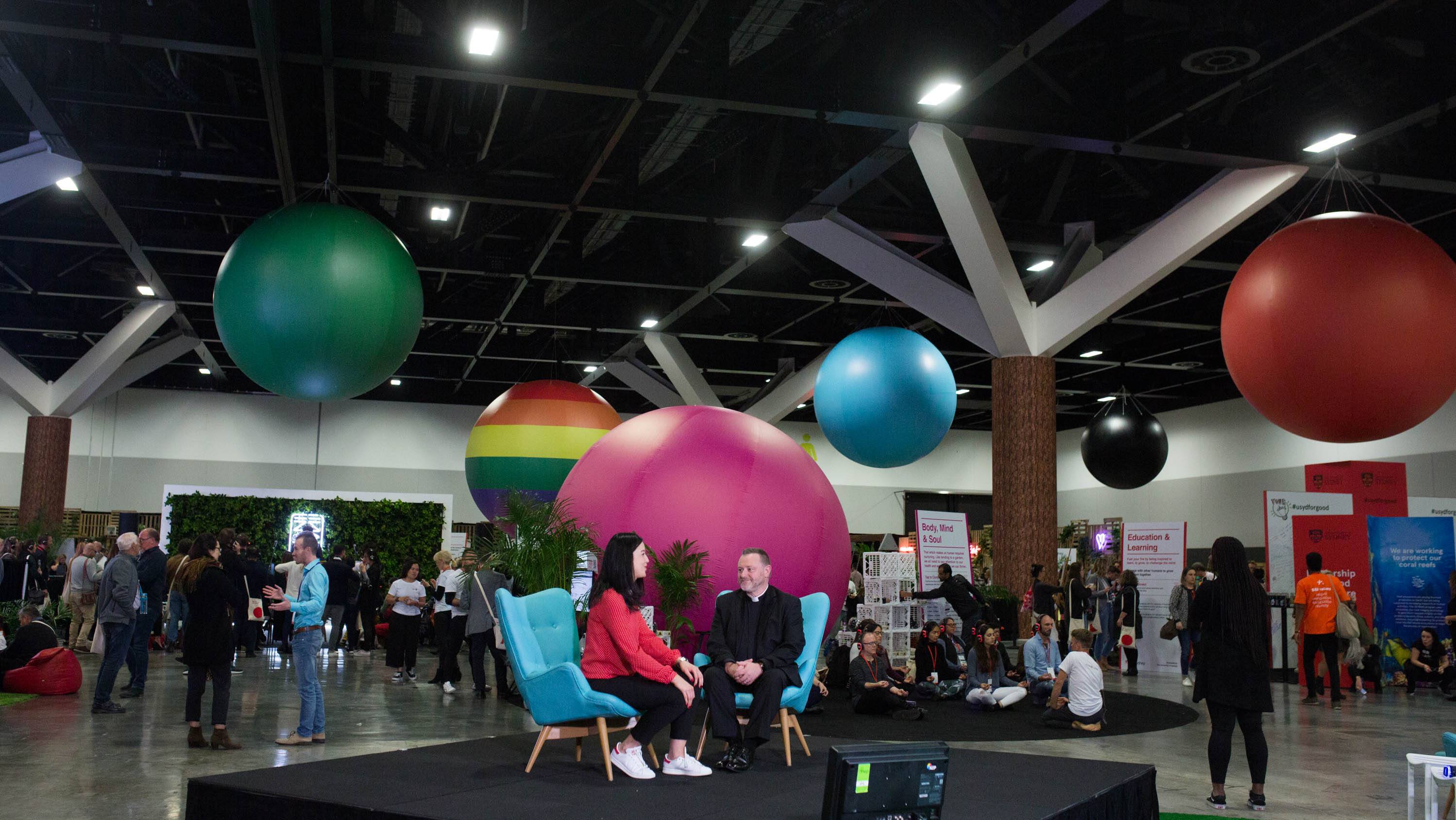
Naturally, we wanted to evolve the identity and focus on the theme HumanKind. The campaign was based on the use of shapes to create a visual connection of all the different elements of TEDxSydney as well as the different groups of people that attend the event. These shapes were used as a visual language to create custom illustrations for the campaign. The idea was the create a connection with TEDxSydney’s variety of audiences, making it more personable and thought-provoking bringing in like-minded people.
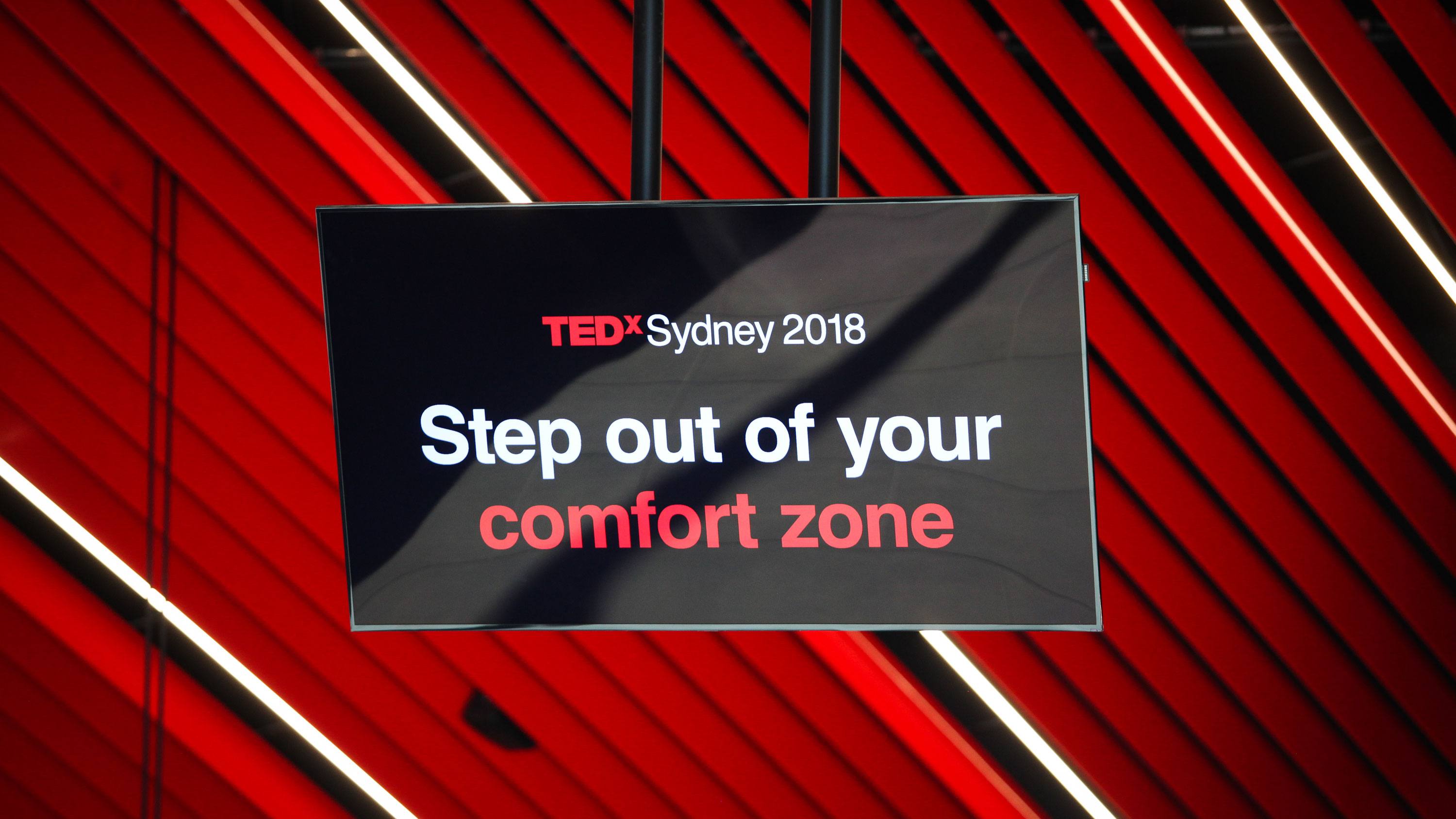
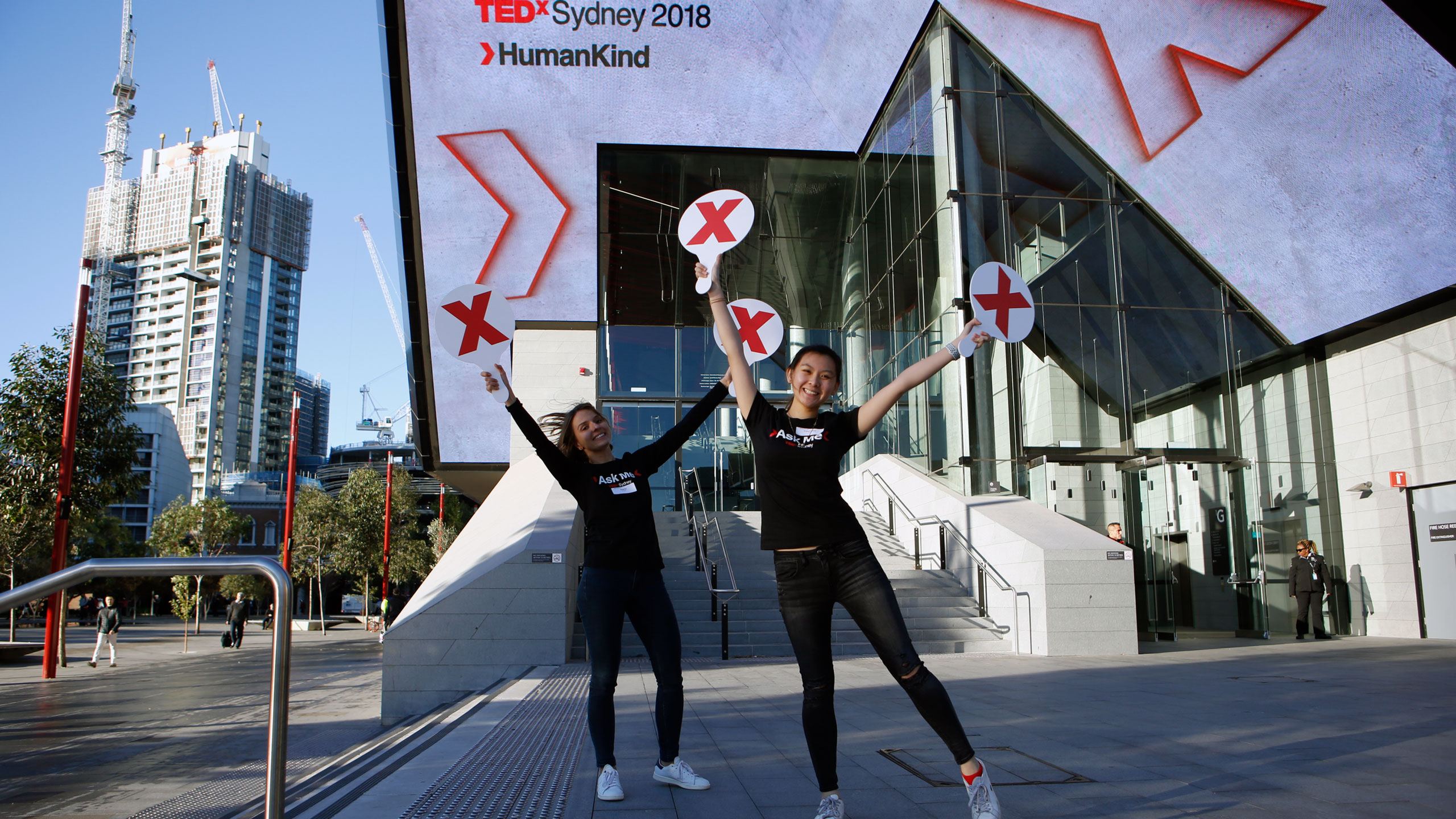
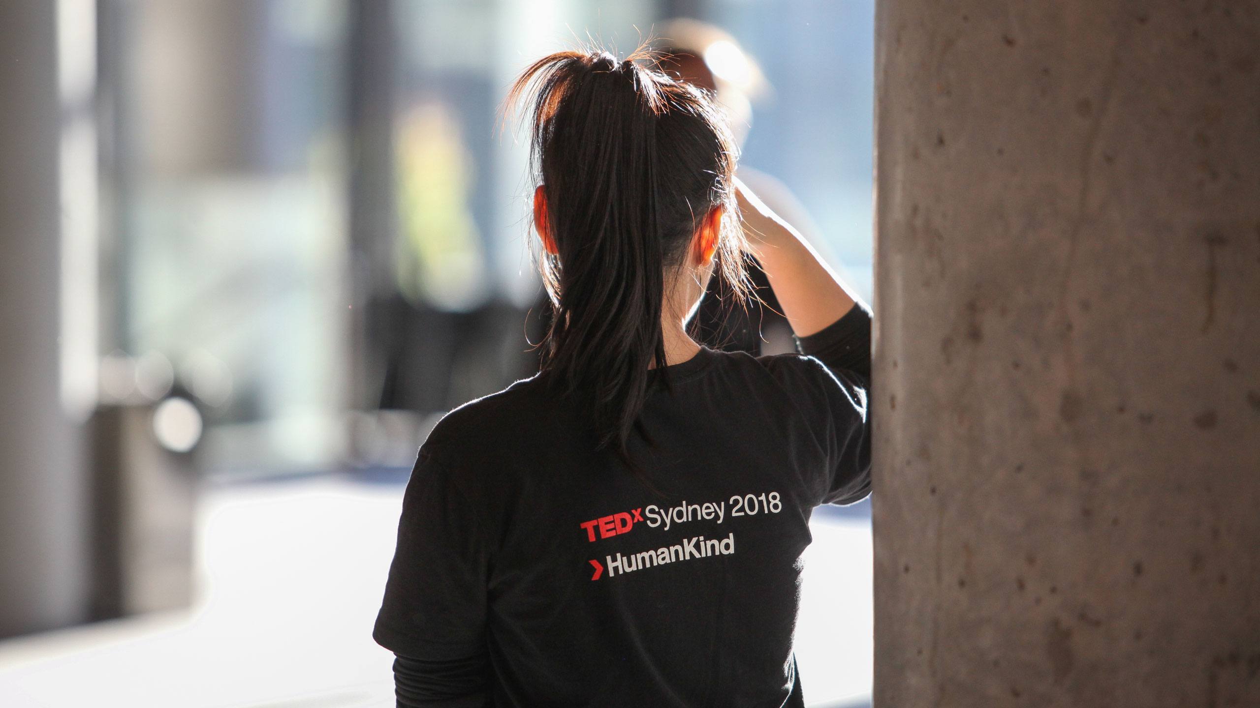
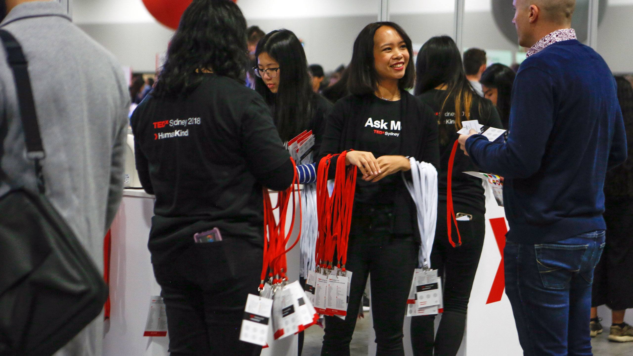
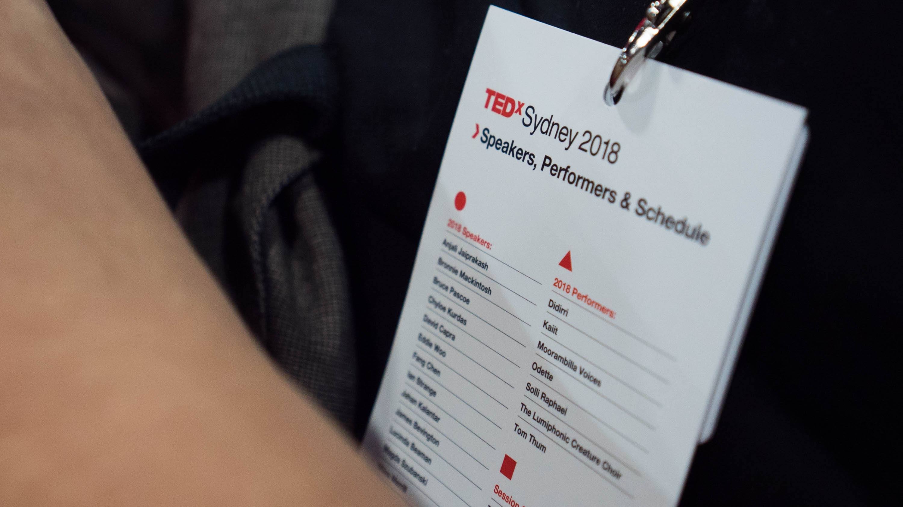
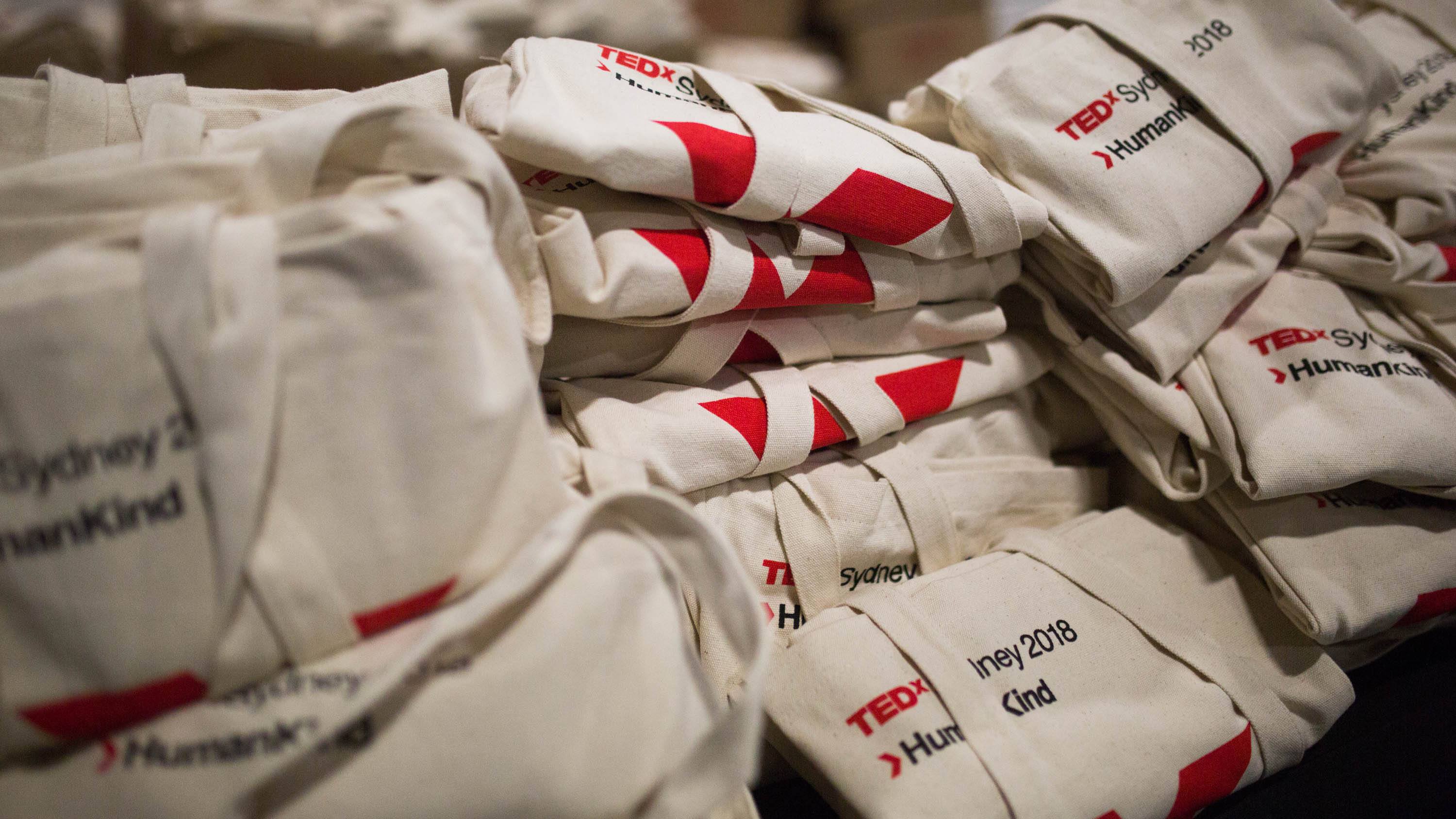
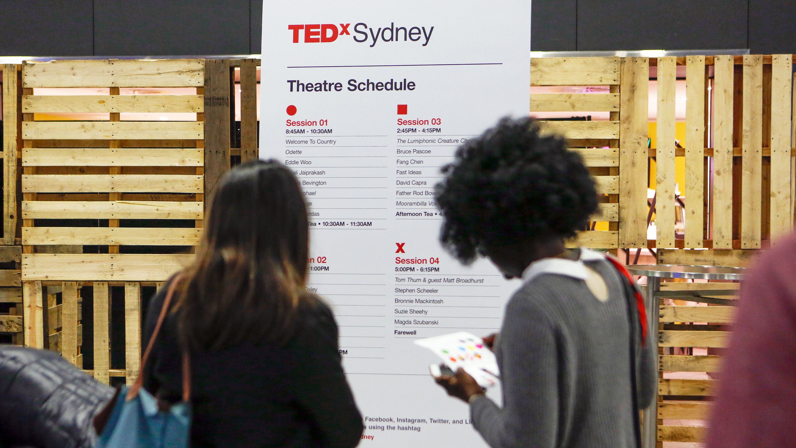
These were used across billboards, programs, digital signage, notebooks, stationary, print ads, banners, signage, lanyard cards, tote bags, shirts, posters, EDMs, venue design, keynote decks, broadcast, social media, videos + much more.
The 2018 was a huge success, the first-ever sold-out event at ICC Sydney with over 5000+ attendees and a positive response across the board.
CREATIVE DIRECTION/DESIGN: Jonathan Key
DESIGN: Catherine Tsang, Angela Tam
PHOTOGRAPHY: The 10th Letter (Jay Patel), JJ Halans, Jonathan Key
ANIMATION: Jonathan Key
Services:
Animation, Branding, Campaign, Creative Direction, Design, Digital,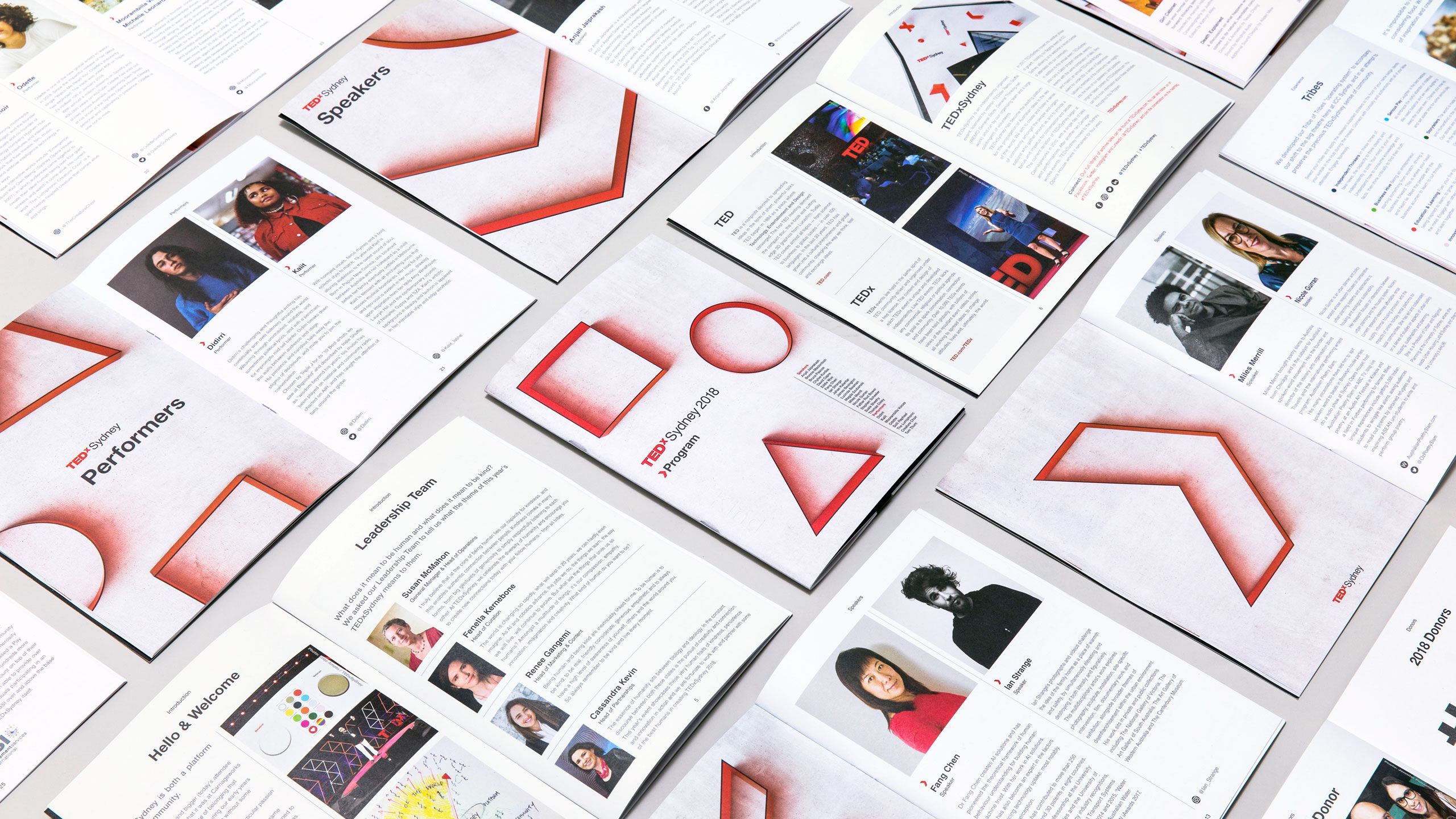
HumanKind • Logo Lockup

Antendee’s Kit. Includes 1 of 4 Tote Bag Designs, Program, Lanyard, Name Tag, Journal, Pen, HumanKind Keyring, Lapel Pin, Bottle
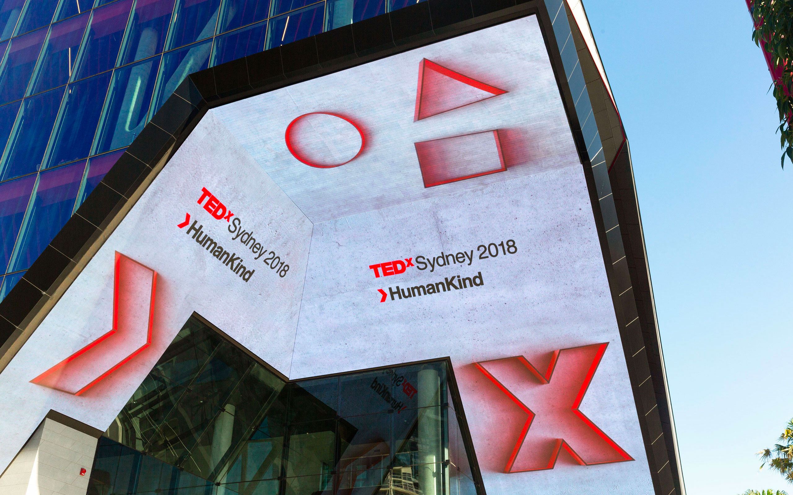
ICC Sydney Bird's Mouth during the day.
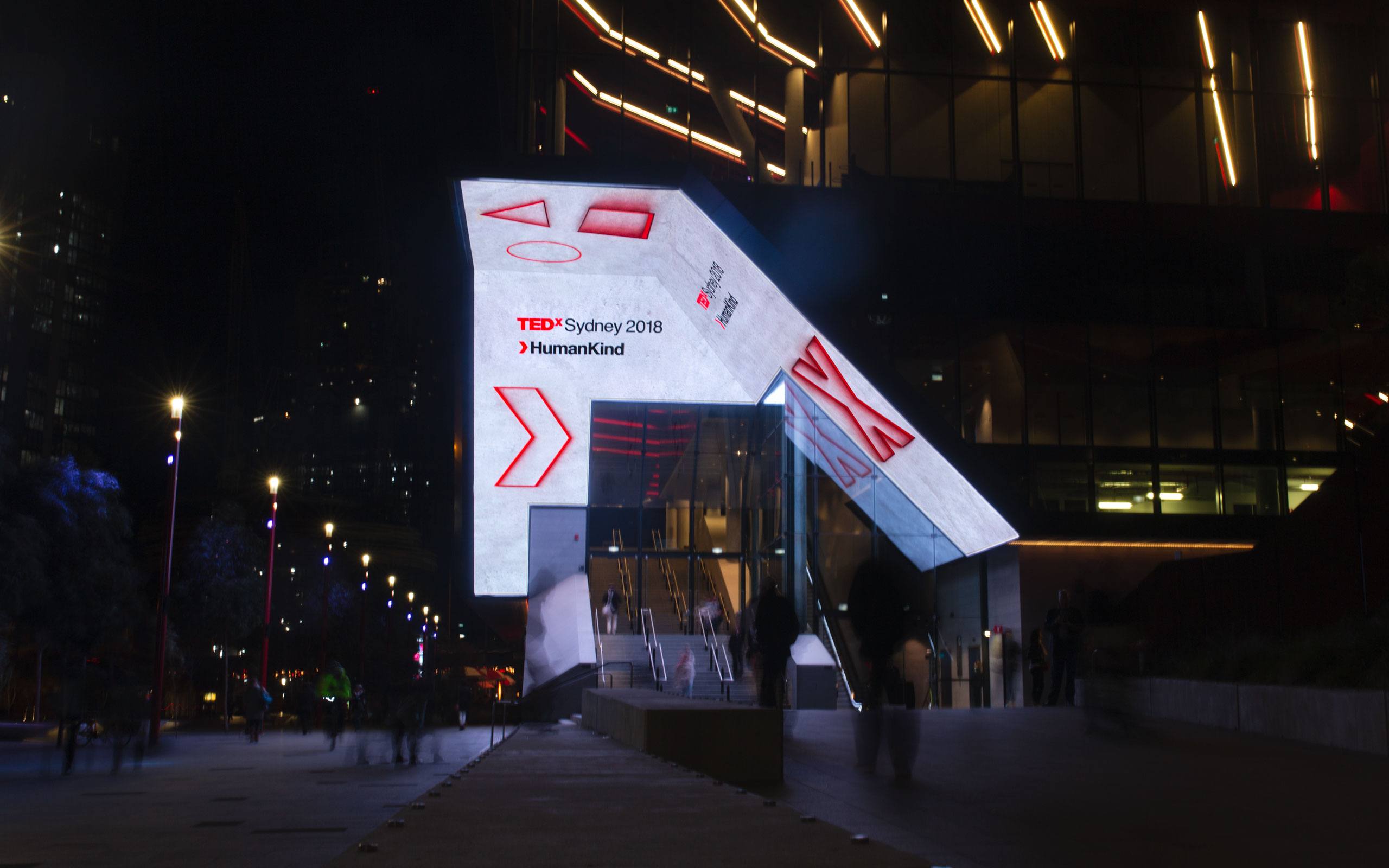
ICC Sydney Bird's Mouth during the night.
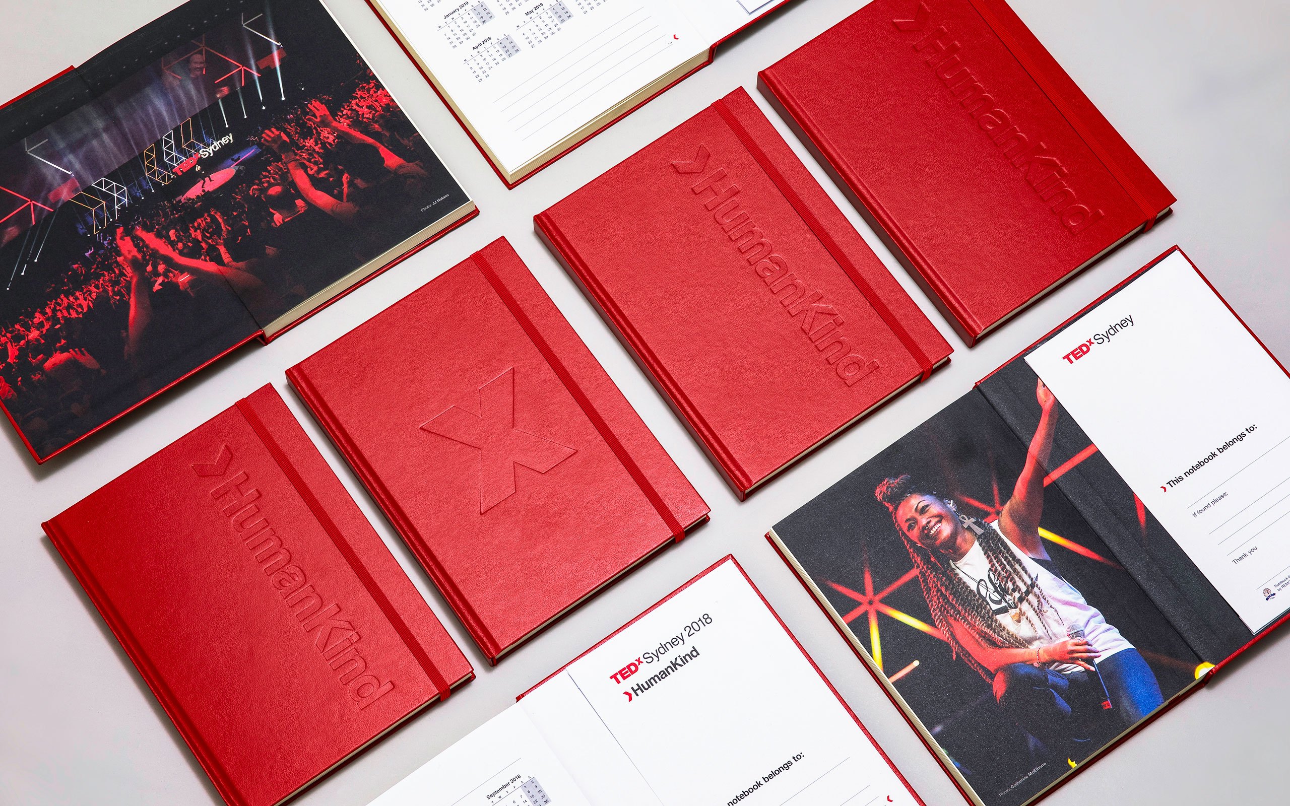
A5 Journal with debossed hard covers, 2018 calendar, perforated and detachable sheets, expandable pocket inside back cover and elastic enclosure band
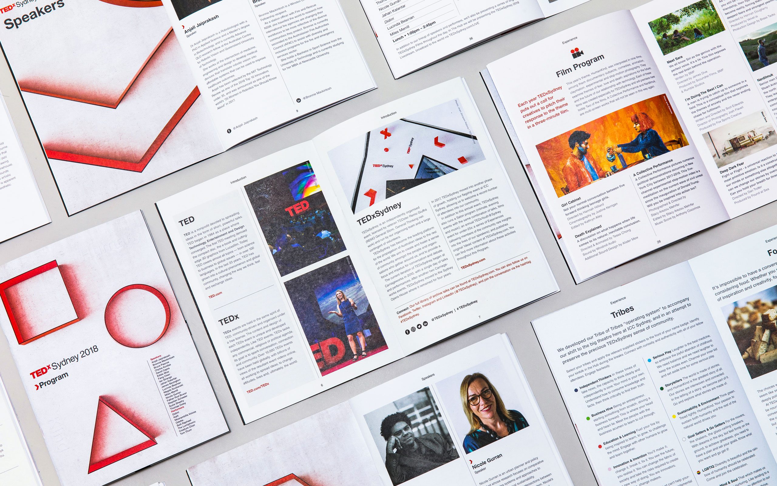
Program Spreads
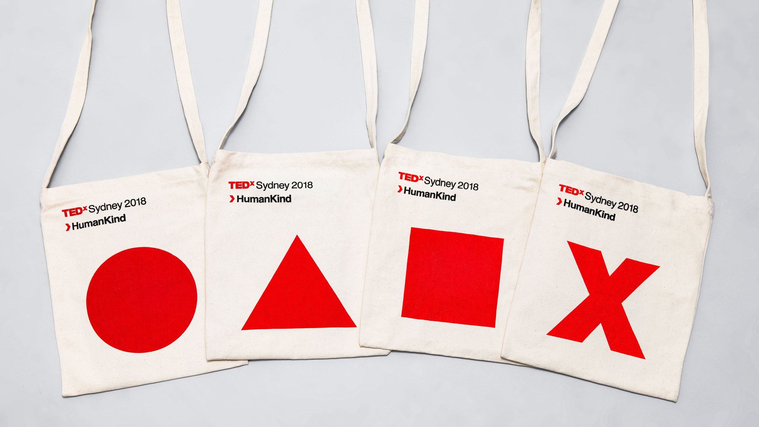
Tote Bag Designs (Circle, Triangle, Square, X)
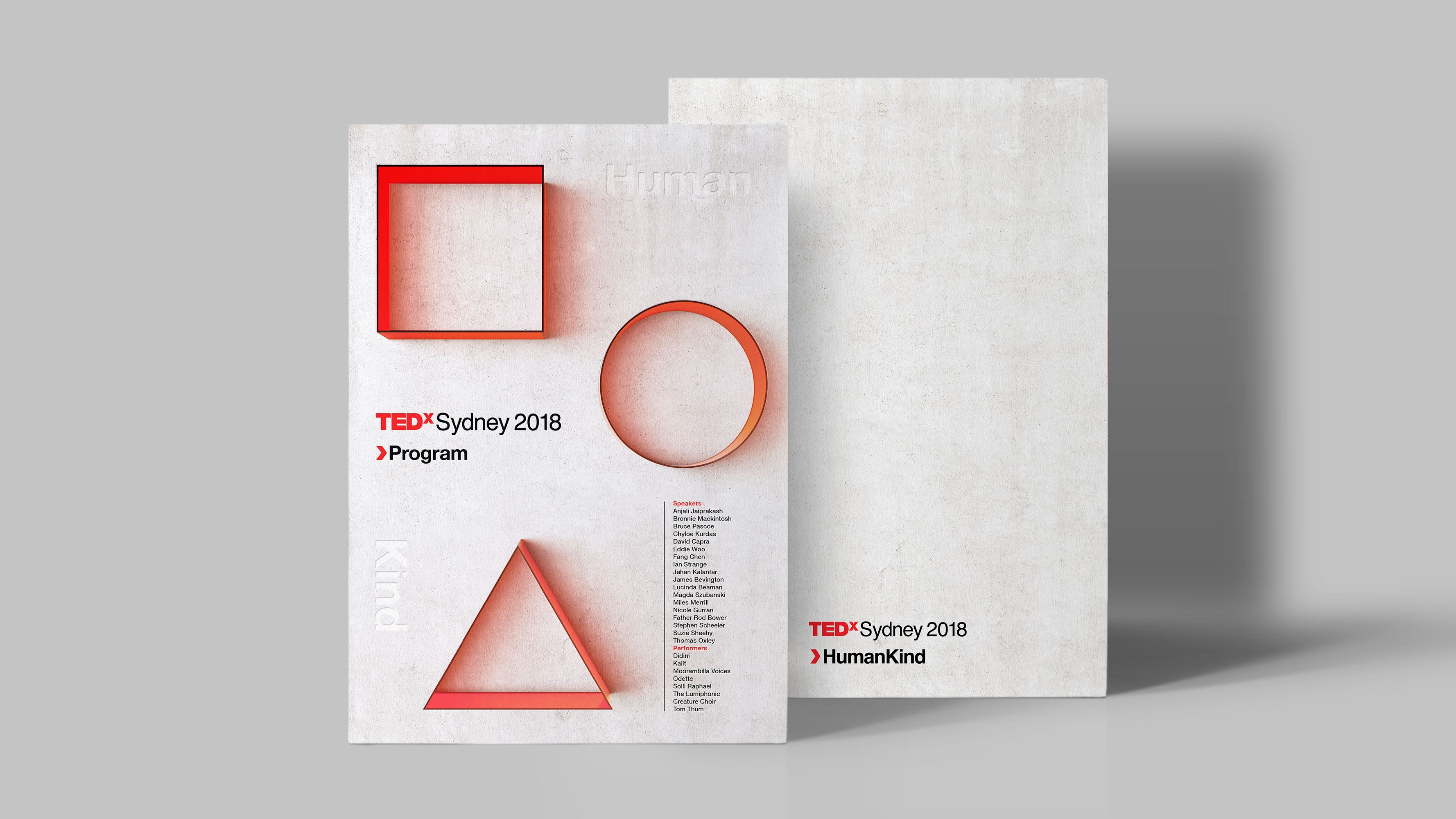
Program Front & Back Cover (Blind Embossed)
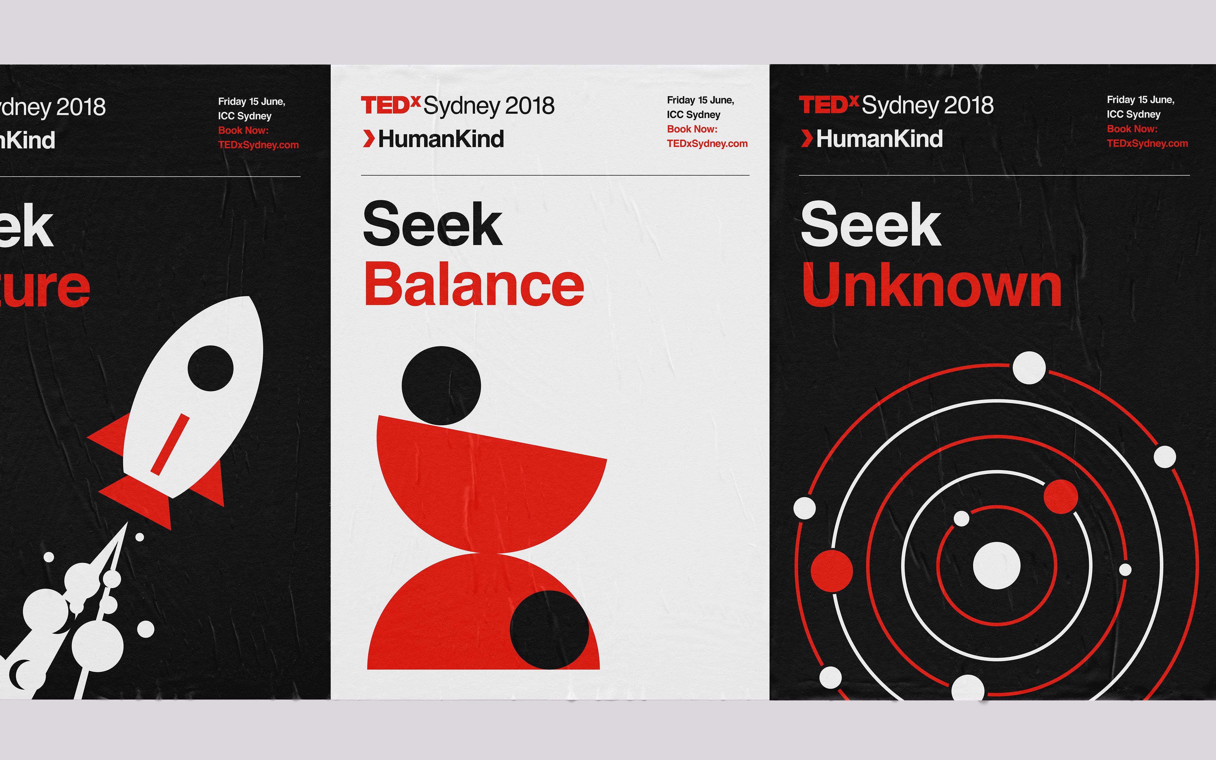
Poster Set • 2 of 2
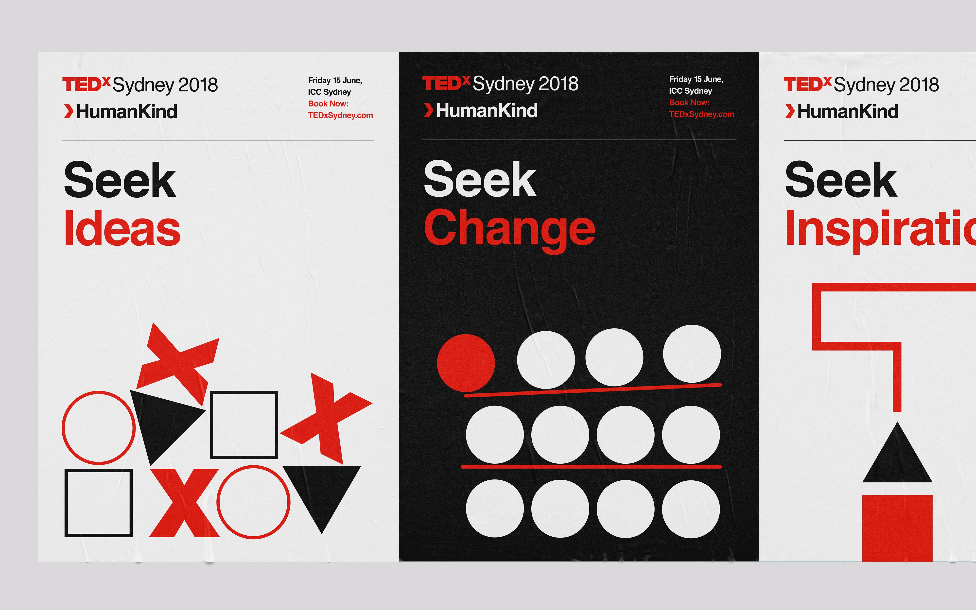
Poster Set • 1 of 2
We loved the thought led design and story-telling elements behind the concepts that Studio 3:AM’s presented. For TEDxSydney 2018 the brief was be bold and different to the creative that had been done previously to stand out and cut through the noise. The final campaign and event collateral did just that and broke the mold resulting in a much more contemporary look and feel giving us artwork that spoke to each vertical and channel of which it was placed.
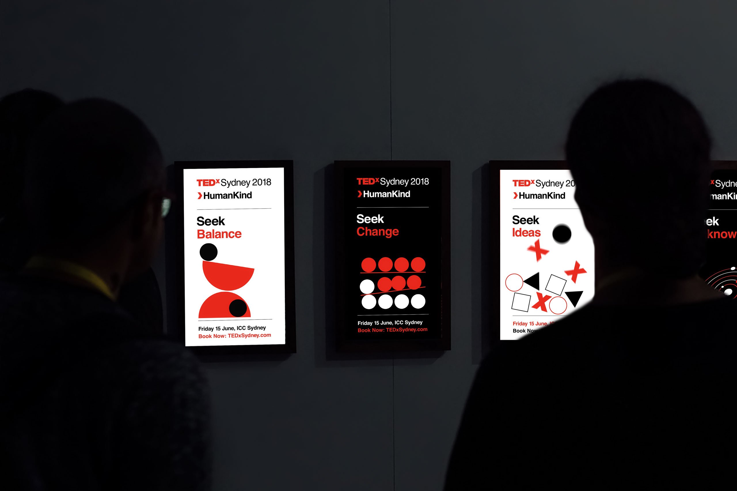
oOh! Media Animated Digital Screens for Outdoor Advertising
Session 01 • Speaker Title
