Redbird - Brand Identity
Redbird
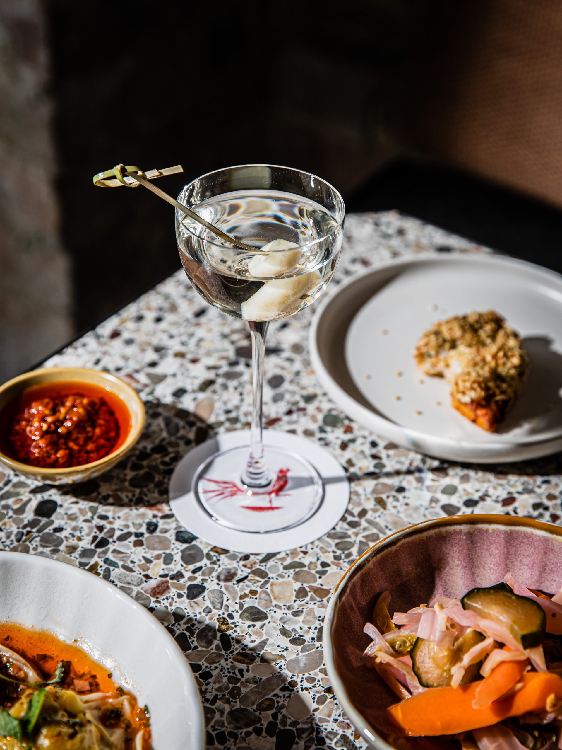
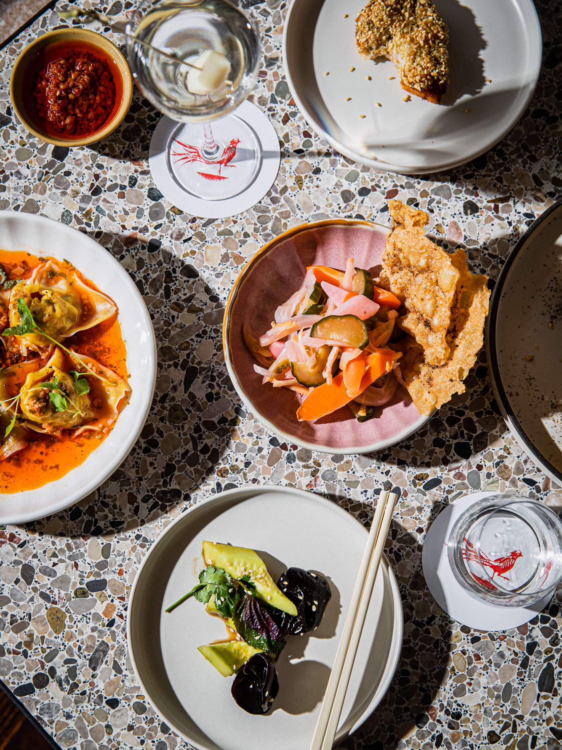
Redbird is a place to feast, linger, wind down and gather over a modern Chinese menu crafted from quality local ingredients.
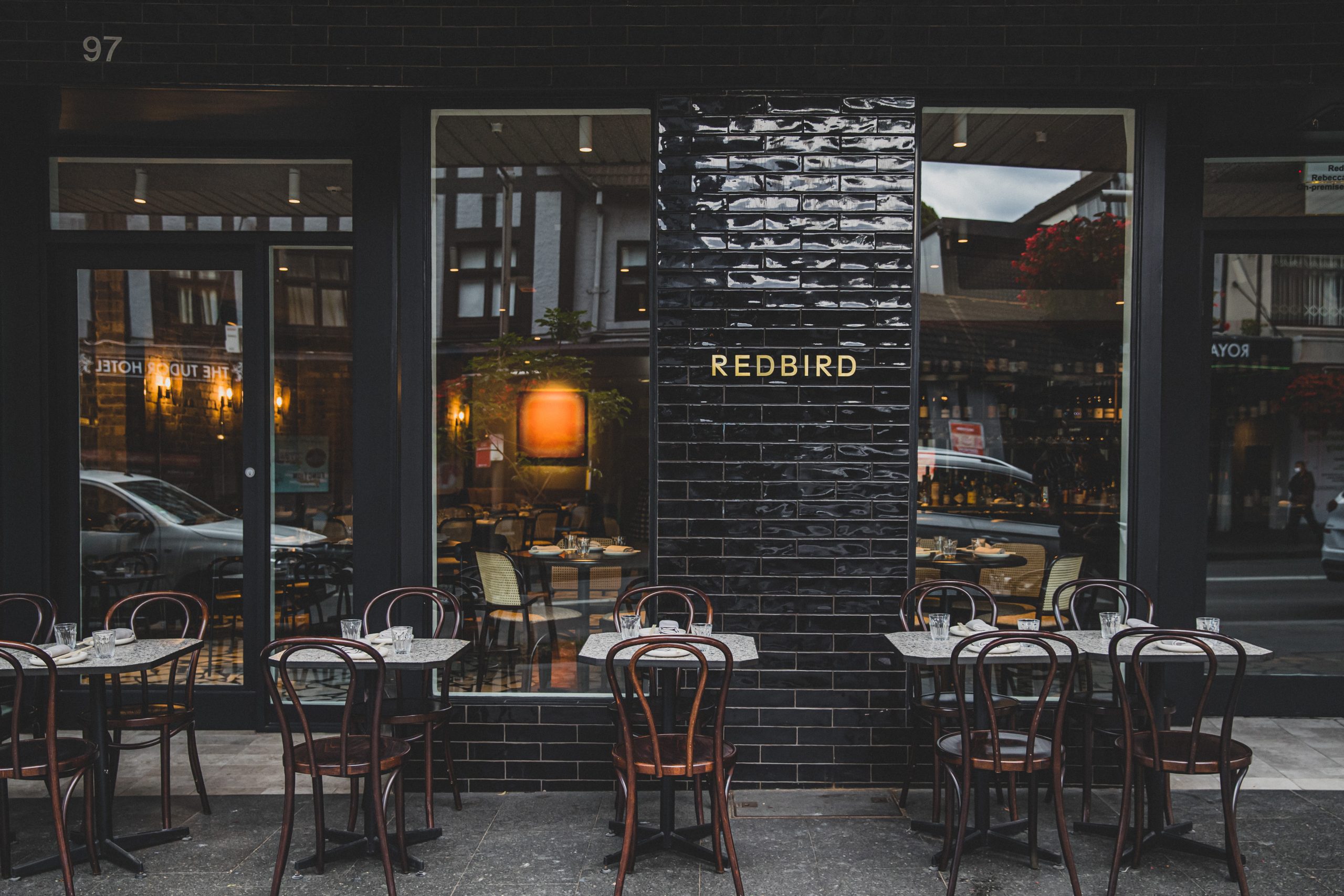
Redbird is a modern Chinese restaurant located in Redfern, with a stripped back minimalist feel. The space was brought to life by restauranteurs and Redfern locals, Rebecca Lines and Hamish Ingham. Redbird is not just a spot for special occasions, Lines and Ingham want people to feel free to pop in spontaneously for a glass of wine and a plate of dumplings.
Read moreRedbird - Brand Identity
Redbird
Redbird is a place to feast, linger, wind down and gather over a modern Chinese menu crafted from quality local ingredients.
Redbird is a modern Chinese restaurant located in Redfern, with a stripped back minimalist feel. The space was brought to life by restauranteurs and Redfern locals, Rebecca Lines and Hamish Ingham. Redbird is not just a spot for special occasions, Lines and Ingham want people to feel free to pop in spontaneously for a glass of wine and a plate of dumplings.
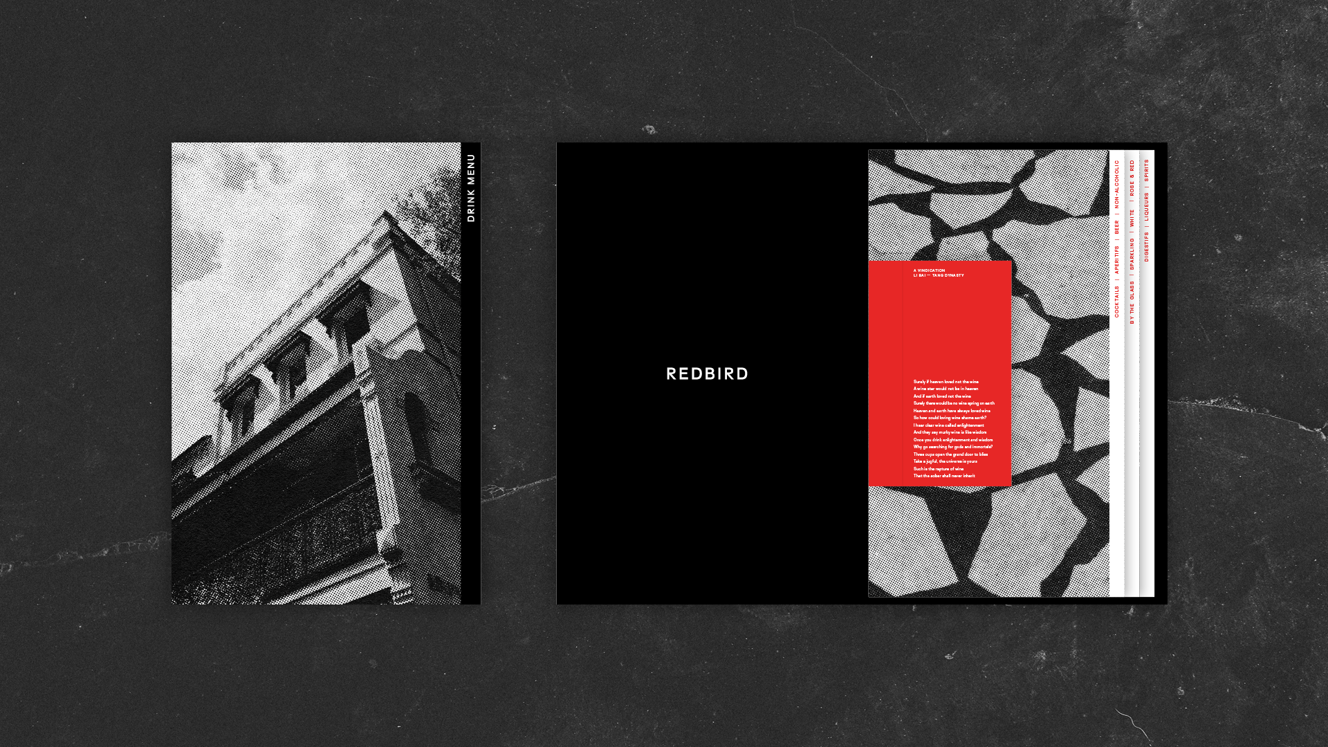
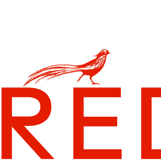
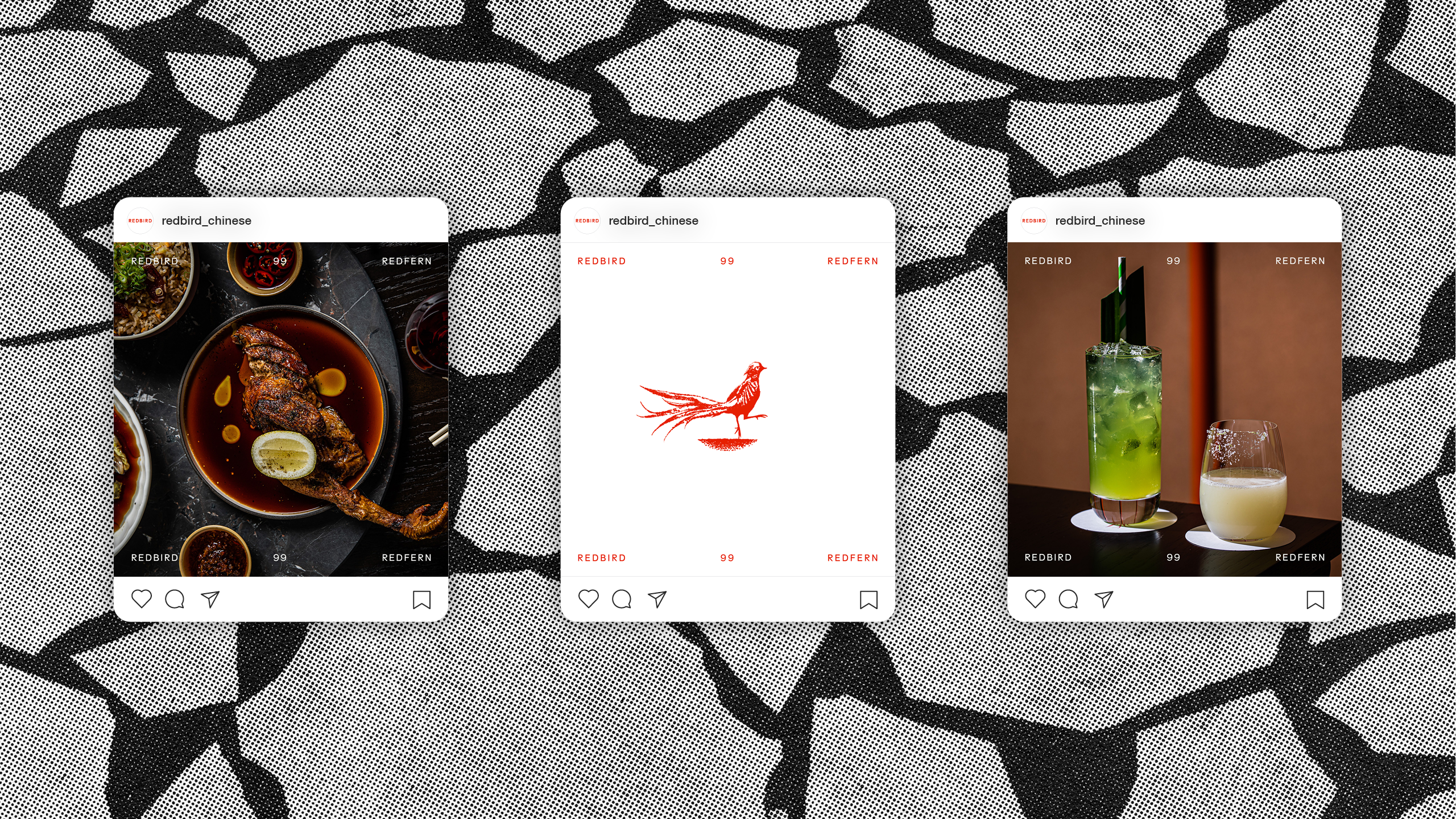
The name was inspired by the Vermillion Bird which is one of the Four Symbols of the Chinese constellations. It is described as a red bird with a five-coloured plumage that is perpetually covered in flames. We designed a minimalist brand identity inspired by both the Vermillion Bird and the modern take of Chinese cuisine. The pictogram of the bird heroes the identity which is supported with juxtaposing clean layouts and minimal typography.
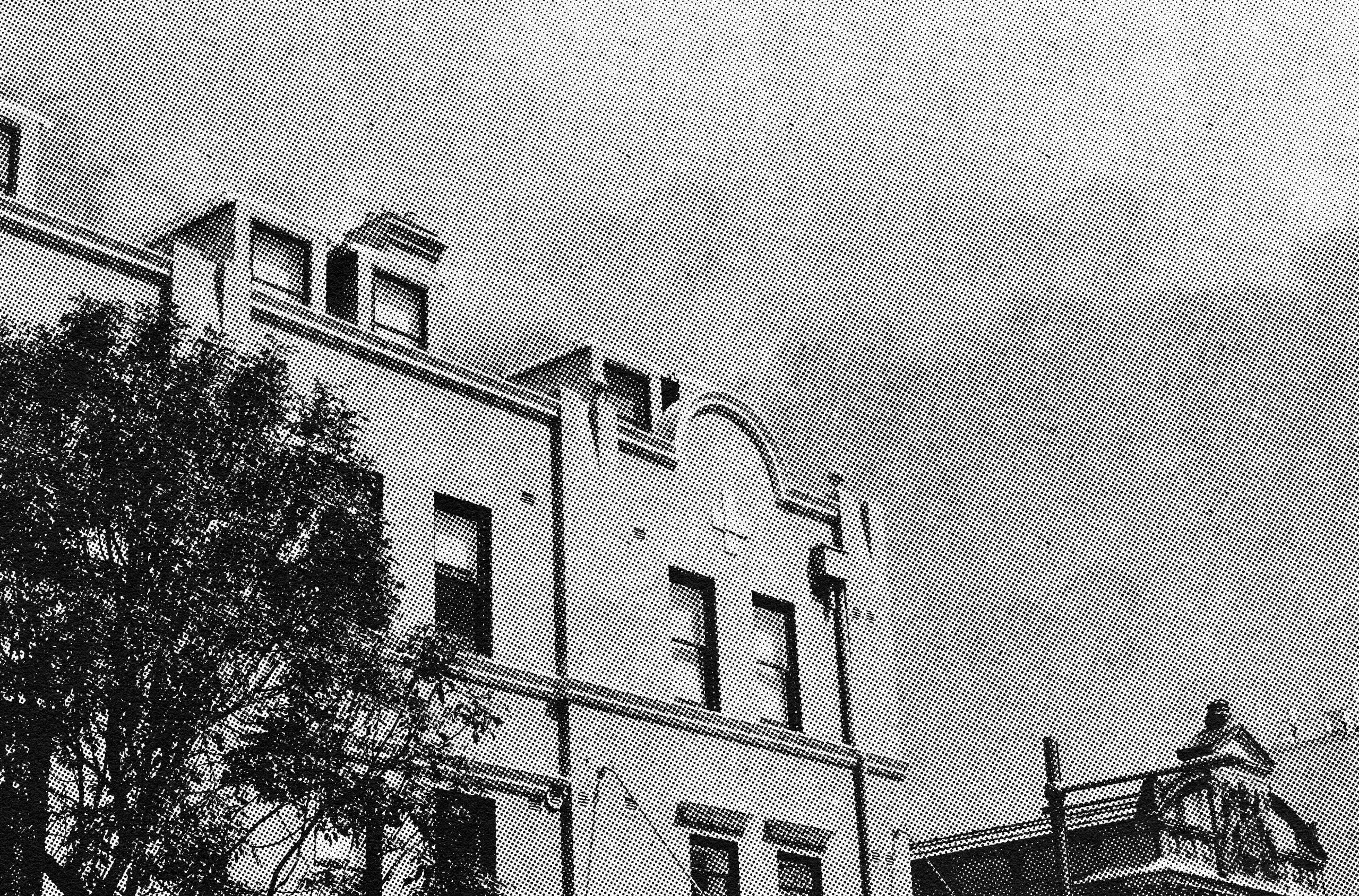
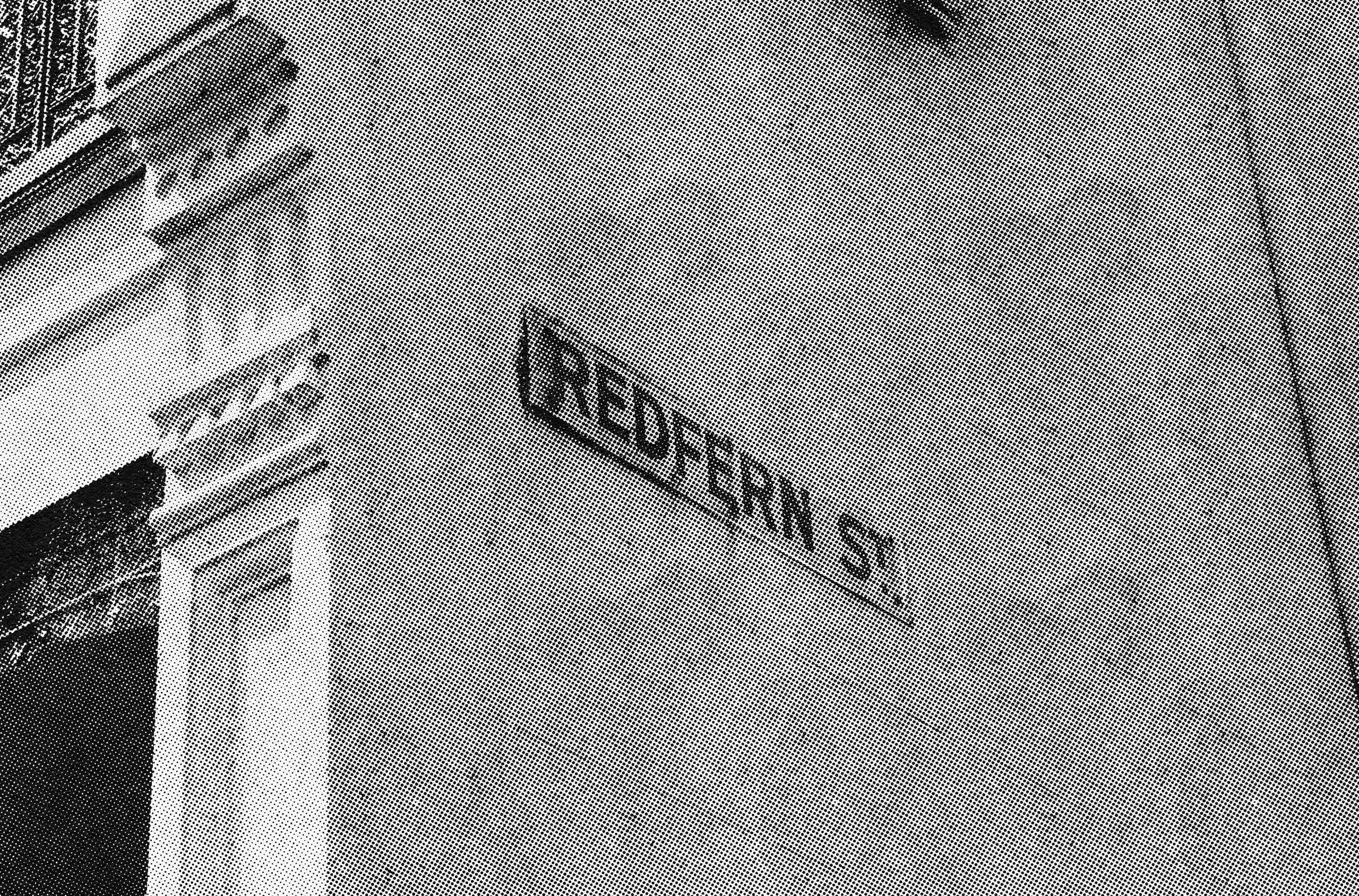
This restrained design concept pairs old-era print and illustration techniques with contemporary minimal design aesthetics. This pairing feels appropriate given Redbird is the junction of dishes inspired by ancient practice for a contemporary audience. The illustration has been hand drawn using a stipple technique which pairs well with halftone treated black and white photography of Redfern. The treatment doesn’t lean into stereotypical visual tropes for Asian restaurants. The aim of this identity is to not shout too loud but to communicate the essence of the brand in an understated manner.
Credits:
Photography — Nikki To
Services:
Branding, Creative Direction, Design,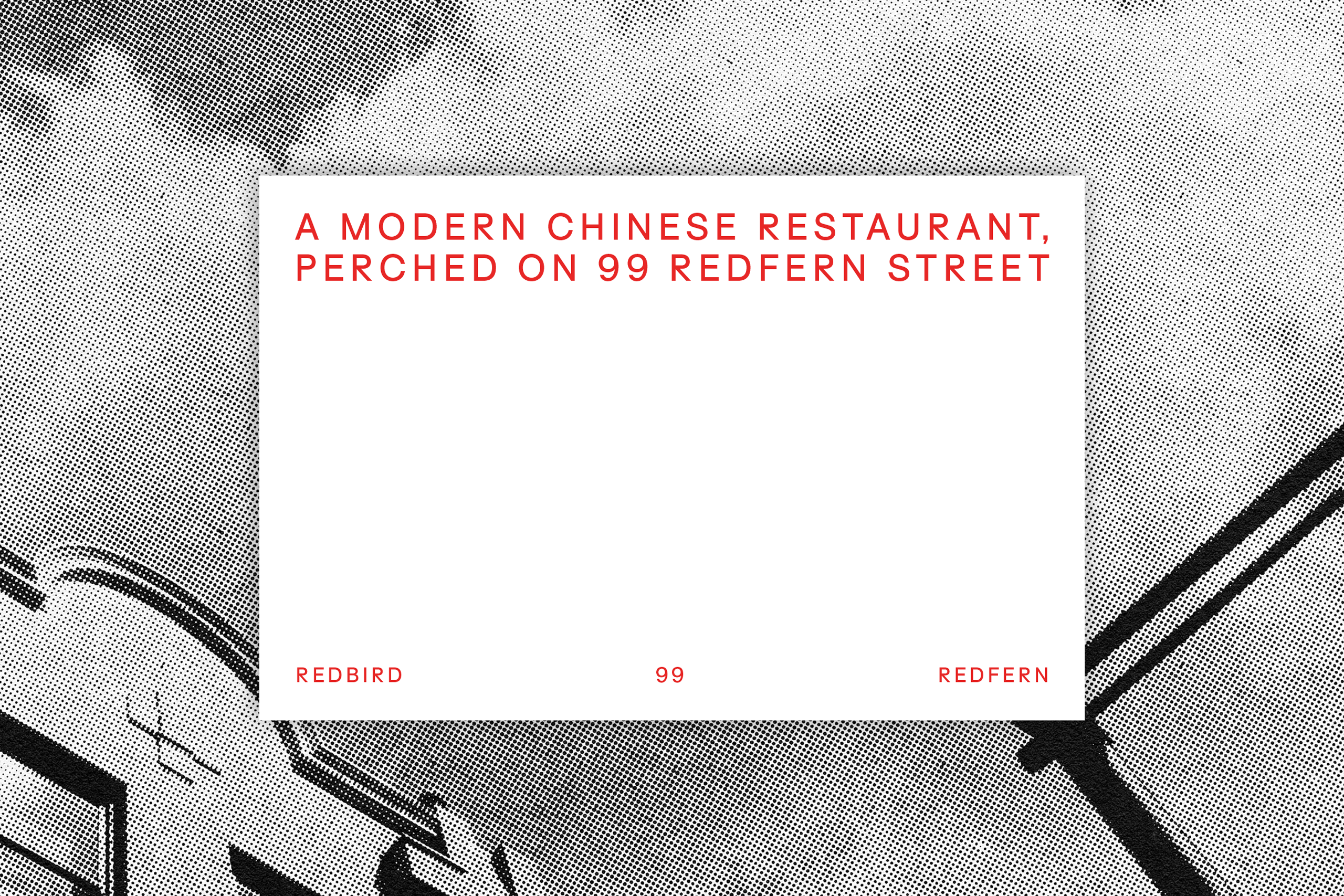
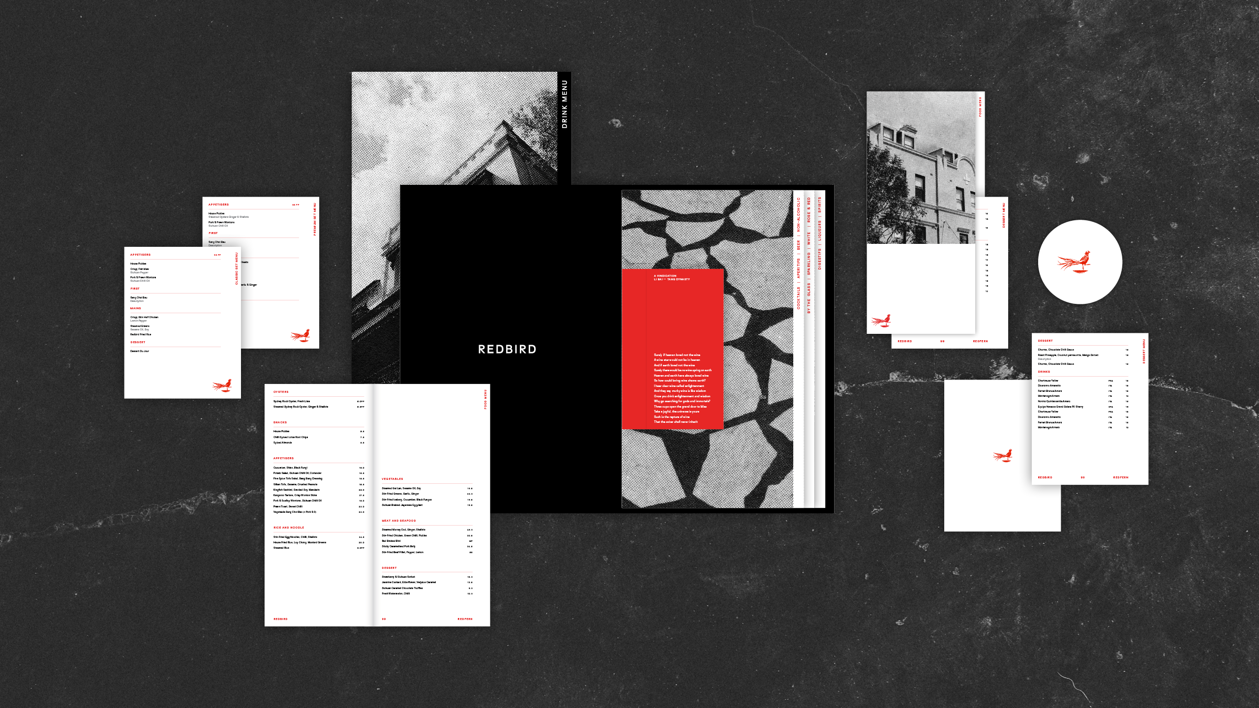
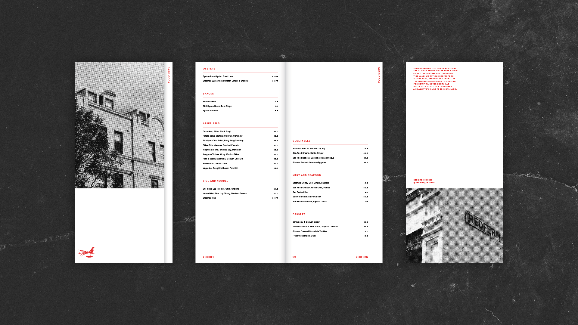
The menu suite highlights the minimal typography and clean layouts that define the brand identity.
The dessert and set menus were designed to be able to fit neatly inside the food menu when being presented to guests. When doing so, the menus line up to form tabs on the right side. The individual designs were created to ensure that these menus would work well as both a set and by themselves. Similarly, the drinks menu incorporate tabs to differentiate between the three different sections within the menu. Halftone black and white photographs of Redfern tie the menu design in with the brand as well as the local area.